You might already have a few ideas about your Chinese tattoo - but choosing where to place it? That's where art, anatomy, calligraphy rules, and personal storytelling all come together.
It's about how the flow, energy, and structure of Chinese characters interact with the curves of the body. A beautifully chosen placement can elevate a simple character into a powerful piece of living calligraphy. A poorly chosen one can make it look cramped, stretched, or simply… confused.
As a calligrapher who writes tattoo designs every day, here's a complete guide to Chinese tattoo placement - with examples for single characters, two-character designs, and short phrases.
⭐ Before You Start: Why Placement Matters More for Chinese Tattoos
Chinese characters are not alphabet letters - they are self-contained visual compositions. Each one has:
- A center of balance
- A rhythm of strokes
- A natural direction of energy
- A spatial “weight” (how dense or open it feels)
Because of this, placement can drastically change how the tattoo looks and feels:
- A character with few strokes looks best small and minimal.
- A complex character needs more space to breathe.
- A vertical phrase needs a long canvas, not a narrow one.
- A horizontal phrase feels more modern than traditional.
Placement isn’t just about your body - it’s about harmony between the design and your anatomy.
1. Single Character Tattoos
Single characters are timeless, symbolic, and incredibly clean. But their placement depends on stroke complexity.
① Minimal Strokes → Minimalist Placements
Best for: 光 (light), 静 (stillness), 仁 (humanity), 山 (mountain), 雨 (rain)
These characters are visually clean and balanced, so placing them in small, elegant spots highlights the beauty of each stroke.
Recommended Placements:
- wrist
- Back of the neck
- Ankle
- Behind the ear
- Side of the hand
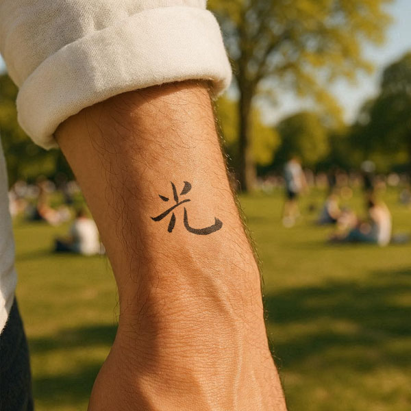
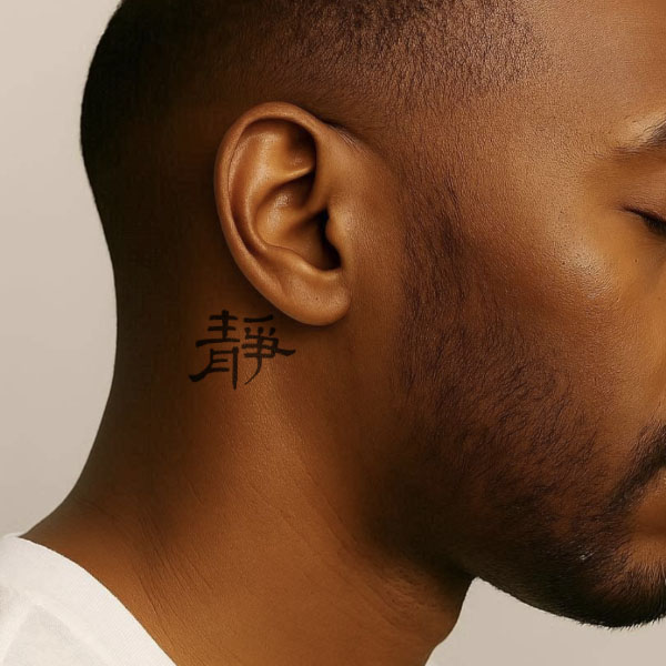
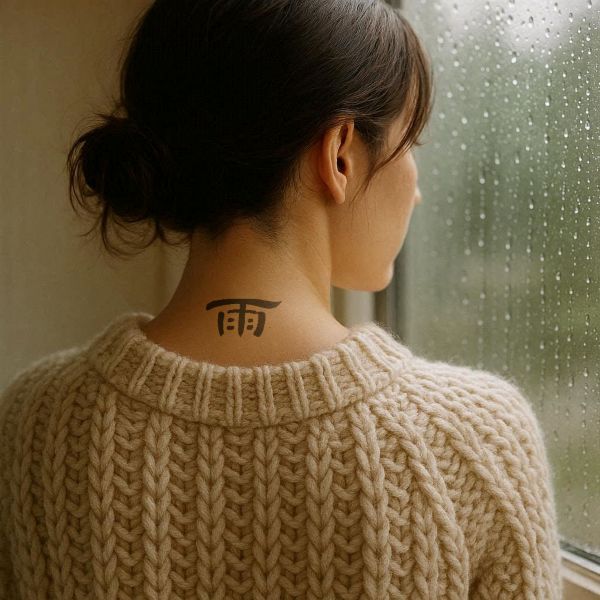
This is the tattoo equivalent of a delicate necklace - small, intentional, and quietly meaningful.
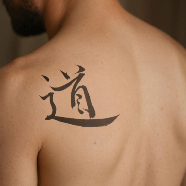
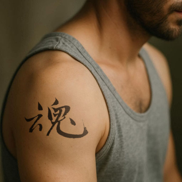
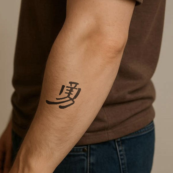
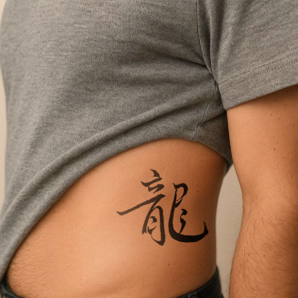
② Complex Characters → Larger, Balanced Areas
Best for: 道 (the Way), 魂 (soul), 靈 (spirit), 勇 (courage), 龍 (dragon)
Characters with many strokes need more breathing room. When squeezed into tiny spaces, they lose clarity.
Recommended Placements:
- Shoulder blade
- Upper arm
- Side ribs
- Upper back
- Outer forearm
2. Two-Character Tattoos
Two-character designs are extremely popular because they create complete concepts like:
- 命运 (destiny)
- 自由 (freedom)
- 光明 (light & clarity)
- 信念 (belief)
- 觉醒 (awakening)
Since they involve structure + flow, placement is all about allowing the characters to move naturally.
① Recommended Placements (Vertical Layout):
Why vertical works beautifully: Chinese was traditionally written vertically for thousands of years. Two characters stacked feel balanced, elegant, and authentic. |
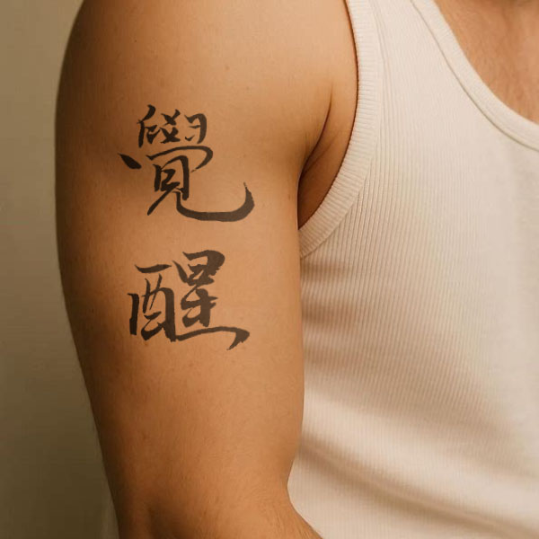
Awakening(觉醒) with Vertical Layout |
② Recommended Placements (Horizontal Layout):
Why horizontal works: Horizontal designs feel modern and minimal, and fit naturally along curved lines of the body. |
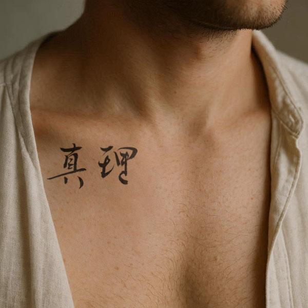
Truth(真理) with Horizontal Layout |
3. Short Phrases (Four to Eight Characters)
Short Chinese phrases are poetic, expressive, and full of rhythm - like tiny fortune-cookie proverbs but way more elegant. They’re perfect for people who want their tattoo to feel meaningful, literary, or just beautifully dramatic.
Classic Examples:
These need space - not only for legibility, but to preserve the flow of calligraphy. |
|
Recommended Placements:To keep the flow natural and aesthetically balanced, short phrases look best on areas with enough vertical or horizontal space:
|
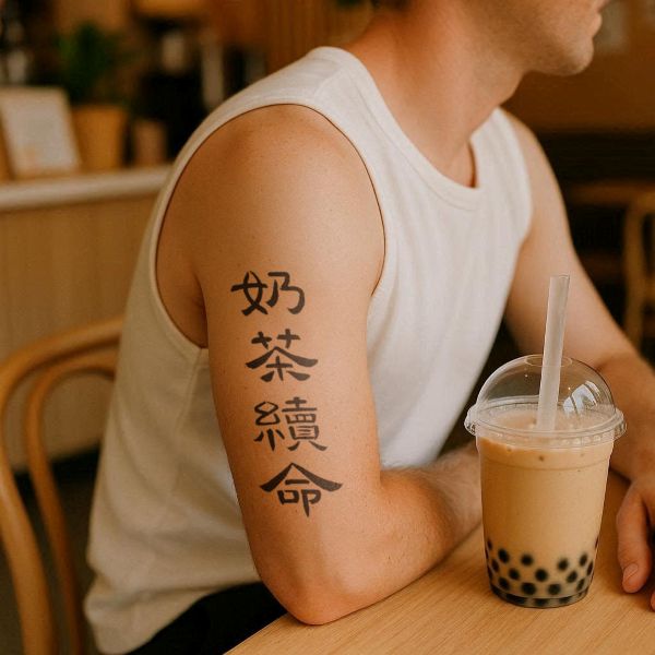
Milk tea for survival (奶茶续命) |
⭐ Bonus Tips: How to Make Your Placement Look Even Better
1. Match your tattoo's "energy" with the body part
- Calm characters → wrist, neck, shoulder
- Bold characters → ribs, forearm, back
2. Match the layout to the natural lines of your body
- Vertical characters → along long vertical lines (spine, forearm, ribs)
- Horizontal characters → across curved areas (collarbone, chest, waist)
3. Consider visibility
Do you want your tattoo:
- Always visible? → wrist, forearm
- Sometimes visible? → upper arm, ankle
- Completely private? → ribs, back
4. Think long-term
Your tattoo will age with you - placement affects longevity and clarity.
Final Thoughts: Choose Placement With Your Story in Mind
The perfect placement is not just where the tattoo fits - it’s where the tattoo feels aligned with your personality, style, and the meaning you want to express.
If you’re choosing a Chinese tattoo, consider three things together:
- Meaning
- Calligraphy style
- Placement & layout
When these three align, your tattoo becomes meaningful, balanced, and beautifully personal.
At Lán Ink Studio, every design comes with professional placement suggestions, accurate cultural background, and handwritten calligraphy - so you can feel confident and inspired before getting inked.
(All Chinese tattoo images featured in this article are original works handwritten by Lan.)